

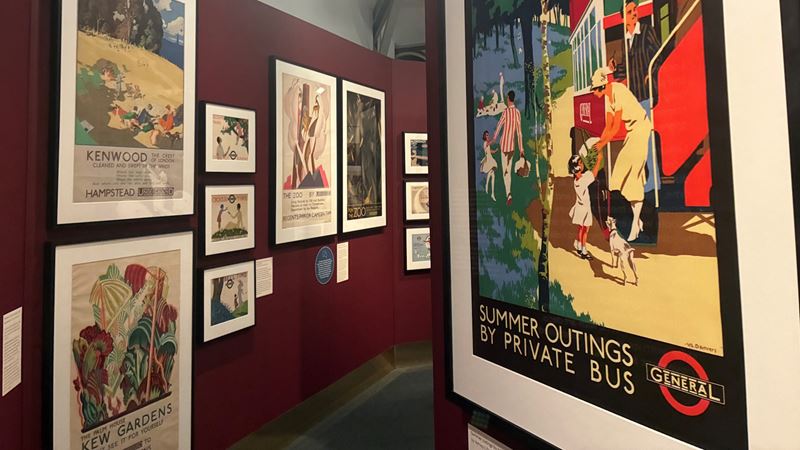
Jonny Payne takes an in-depth look at Art Deco: The Golden Age of Poster Design, ahead of its opening on 21 November 2025 and chats to its lead curator for top tips and insights.
Key exhibition information:
- Dates: 21 Nov 2025 – spring 2027
- Opening times: Monday to Sunday 10am-6pm (last entry 5pm)
- Location: Global Poster Gallery (first floor), London Transport Museum, Covent Garden Piazza, Covent Garden, London, WC2E 7BB
- Entry: Included in standard London Transport Museum admission
Book your London Transport Museum visit now
Jump ahead to the relevant section:
- What’s the exhibition about?
- What to see
- What are the highlights?
- What are the most surprising items?
- How to see the exhibition
- Q&A with the curator: tips and insights
What’s Art Deco: The Golden Age of Poster Design about?
Instantly recognisable, the clean, colourful and geometric traits of art deco design have been synonymous with the London transport network for a century. This new major exhibition takes a visual journey through the iconic style that blossomed in the 1920s and 1930s, when posters, artworks and architectural features were ever-present on Tubes, trains, trams and buses.
Senior Curator Georgia Morley and her team have handpicked more than 100 of these posters from the museum’s collection of 30,000 artworks – two thirds of which have not previously been on display. It makes for an eye-catching show that delves into art deco’s use as a visual aid for practical and inspirational messaging.
Held over two floors in the Global Poster Gallery, this new London Transport Museum exhibition also brings together objects on loan from other museums, as well as short films, photography and an interactive display to unpick the surprisingly ambiguous history of art deco design.
What to see at the London Transport Museum poster exhibition
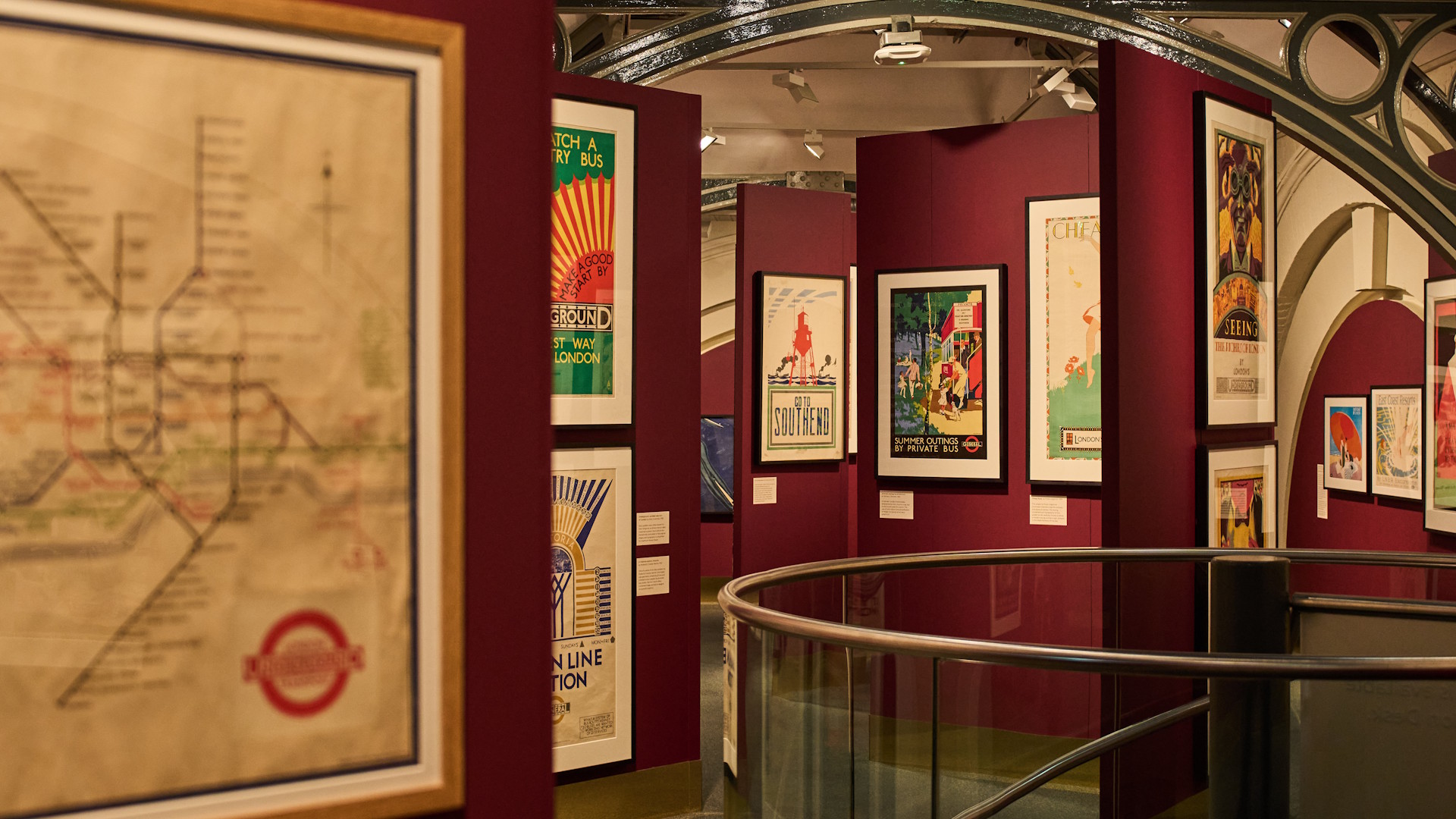
Make sure to follow the narrative that charts art deco’s origins from the 1910s onwards, including the influence of the 1925 Paris Exhibition (Exposition Internationale des Arts Decoratifs et Industriels Modernes), which catapulted the style into the mainstream.
I soon learn the role art deco style played in post-war Europe, when more leisure time and advancing women’s rights in the 1920s allowed for greater freedom in a fast-changing world... all things the posters tap into with clever messaging and clear design,
I’m struck by how the posters are beautiful artworks in their own right. I’m told they sell many of these in the museum’s shop – sadly my wall space is full, otherwise I’d likely have picked up a few on the way out!
I take my time to study how the posters encourage visits to attractions, gardens, theatres, shopping and even day trips to the seaside for family fun. It’s clear each designer – including the likes of Dora Batty, Edward McKnight Kauffer and Frederick Charles Herrick – has their own style and uses different techniques, from the bold to the subtle.
On the lower floor, don’t miss photographs and items relating to art deco architecture – especially features of Tube stations designed by architect Charles Holden, many of which are still present today. This continuing legacy is also represented with modern-day moquettes (those iconic designs on the seats of Tube trains and buses) and contemporary posters influenced by art deco design.
Author’s tip: Study posters closely to pick out fashion of the day – whether encouraging shopping visits or subtly showcasing high fashion, this helped to target the aspirational female population of the day.
What are the highlights of this new exhibition at London Transport Museum?

Seeing the posters displayed alongside each other as I enter the Global Poster Gallery – which is home to this new London transport posters exhibition until 2027 – is visually very striking and I love studying each up close to interpret the thinking behind the designs.
The narrative is fascinating, and it really helps me to learn (and question) exactly what art deco is and how it has played a key role in making London’s transport network so popular. London Transport was keen to tap into the new-fangled notion of leisure time, thanks to paid annual leave and public holidays. So, with the dawning of mass production, clear, simple and colourful designs could be created quickly (in poster form) to encourage Londoners to fill their leisure time with evenings out at the theatre, shopping trips, family days out and more. It’s something I feel resonates in advertising as much today as in the 1920s.
The posters are the stars for me, but objects loaned from various organisations also add to the overall art deco story – my favourite being a Lalique glass car mascot of Victory (also known as Spirit of the Wind) on loan from Beaulieu Motor Museum.
Although a little light on interactive elements, there’s a touchscreen display that asks me to question what art deco graphic design really is. I pick three posters that I feel epitomise the art deco style and then rate how the message, technique and colour fit the style. I find it’s a clever way of putting into practice what I’d learned up to that point and it nicely ties into the narrative at the start.
Author’s tip: Look out for the striking use of dark and bright colours in Verney L Danvers’ Theatres poster – showing a theatre-going couple rising up from the Underground into a theatre. Another piece that catches my eye is Cyril Power’s small-scale artwork The Tube train, which depicts commuters reading newspapers – an everyday scene that’s captured in a bold and colourful way. But, my favourite is the Kew Gardens Palm House poster: its vivid geometric plant shapes must have made it very enticing at the time.
What are the most surprising items at the exhibition?
I’m surprised by the breadth of subjects on the posters – not only are there messages showcasing the speed and ease of using the transport network, but also wide-ranging themes covering shopping, theatre, attractions, events and day trips.
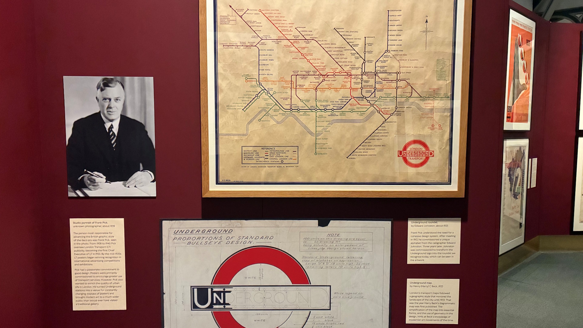
As well as touching on Harry Beck’s iconic Tube map, the exhibition also shares the story behind a specific typeface used on the London Transport network… The story goes that Frank Pick – who ruled the design roost at London Transport – employed Edward Johnston to create a specific sans serif typeface, that survives to this day. Pick also played a pivotal role in commissioning young British and international artists to create many of the posters on display.
How to see the London transport poster exhibition
Entry to Art Deco: the Golden Age of Poster Design is included within entry to the London Transport Museum. Book your visit to London Transport Museum now.
Questions for the curator: Georgia Morley, Senior Curator
How influential was the art deco period on the London transport network?
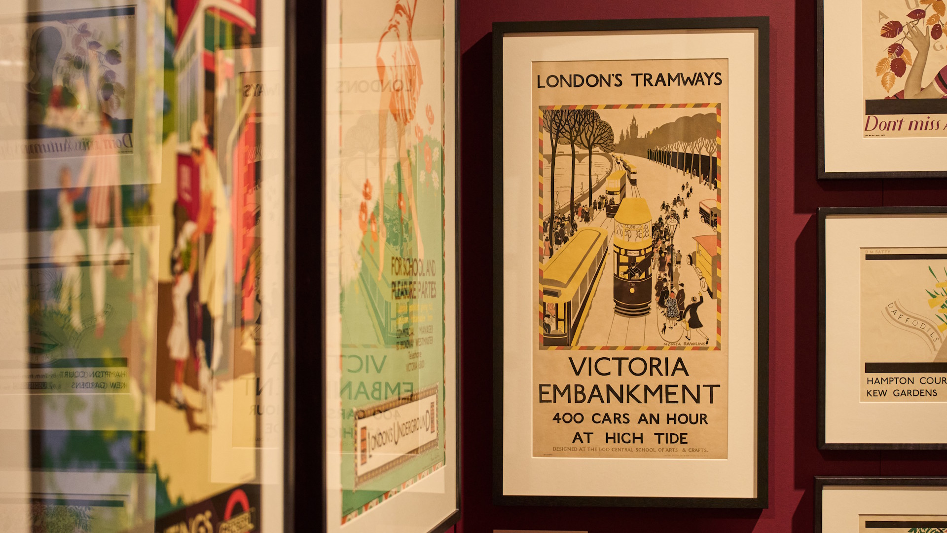
It was hugely influential. The art deco style works particularly effectively for poster design. I think the key features of art deco having clean lines, simple geometry and bold colours all work well for advertising purposes… but particularly for transport, because anyone on the street needed to understand these posters and the message very quickly.
But it wasn’t only posters… it was also more widely within London transport. Frank Pick, who ran the publicity for London Transport from 1908 and was chief executive from 1933, wanted a cohesive design system not only for posters, but also for architecture.
How important was Edward Johnston’s typeface in maintaining the London Transport brand?
It has been really important in having a unified branding that anyone can recognise. It’s a bold typeface and immediately recognisable, it’s clear too, which is important. It’s been significant to have the Johnston typeface since 1916 and Johnston 100 typeface now. The original Johnston typeface didn’t have things such as exclamation marks and hashtags, that’s why Johnston 100 was created to develop alongside society.
What do you think makes these posters so iconic, even to this day?
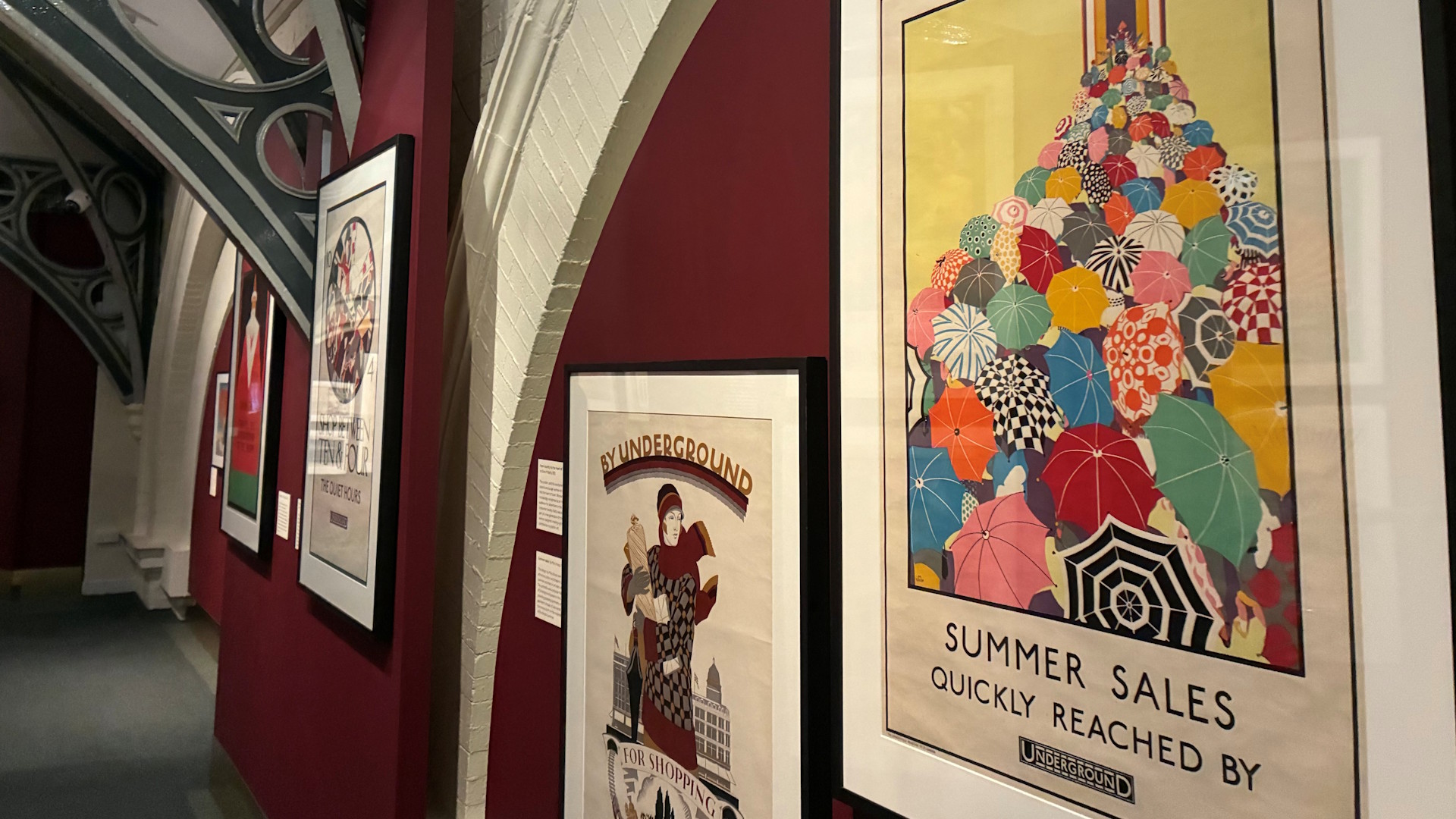
They’re timeless and modern. Their subjects are still appealing to people today: we still do similar things. The art deco posters from the 1920s and 1930s show people going to the theatre, shopping, zoo, waterside or seaside, and we still like to do those things today.
People love to see where they live and where they spend their time – for example Hampstead Heath and Kew, which are really identifiable locations across London. Also, I think the theme of glamour and opulence really appeals to people.
Do you have a favourite theme?
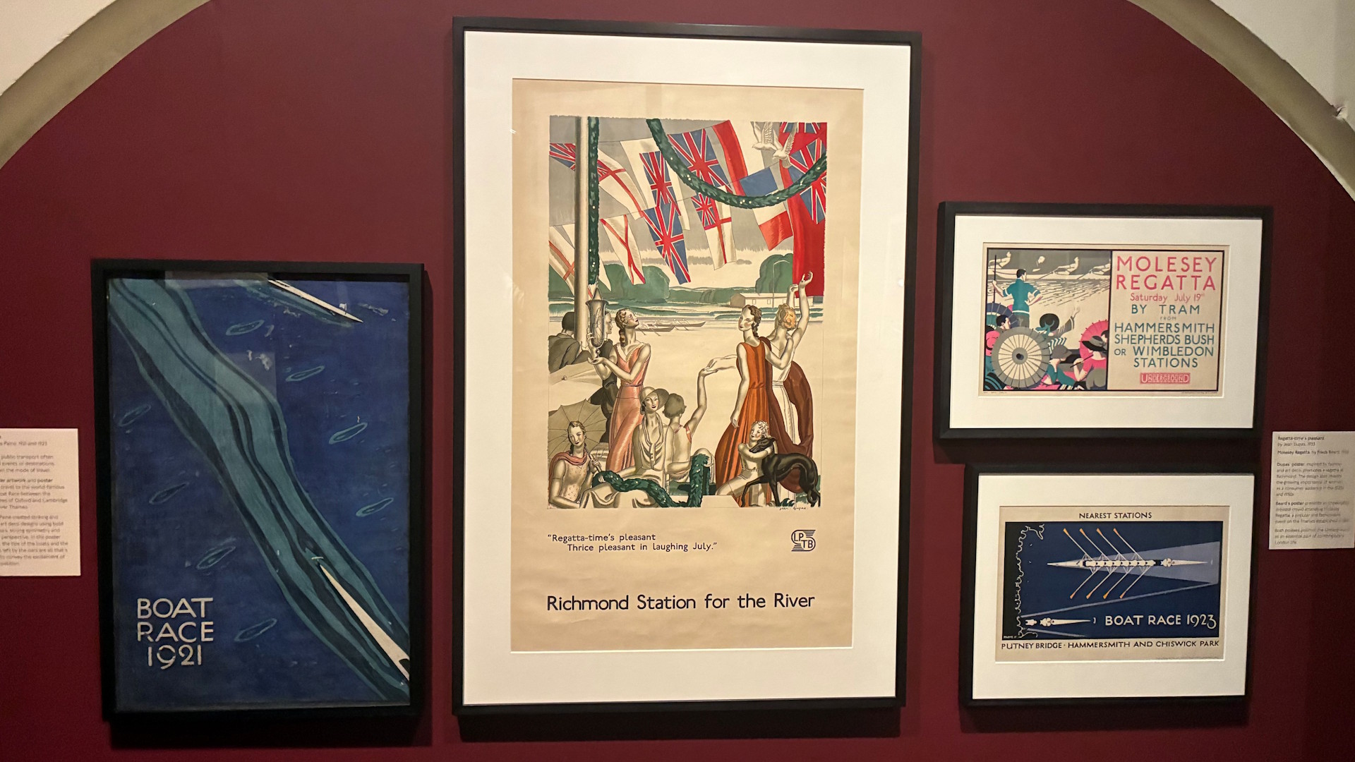
I really like the waterside ones: trips to the river, events such as regattas and The Boat Race. The seaside posters, in particular, are joyful and are about having fun.
With the introduction of public holidays and paid annual leave, people were travelling for leisure, which they hadn’t done before – they had only travelled for work primarily. They now didn’t just want transport to get from A to B, they wanted to enjoy it!
What's your favourite item in the exhibition?
My favourite object within the exhibition is the Vera Willoughby poster just in the entrance, called General Joy. It has bright yellow colours and the sun in the corner – the very art deco sun rays coming down, and a 1920s open-top bus… people just look like they’re having a great time!
There’s a woman in the front with finger-wave short hair that’s blowing in the wind – it’s really representative of the freedom women had at the time: women had the vote in 1918, so the 1920s was a time where they had more freedom and could go out to enjoy their leisure time. They were seen as new consumers, so were really important at that time.
There’s also a young family in the foreground… and the fashion that they’re wearing… a couple are wearing flapper dresses so it shows what’s fashionable at the time, moving away from Victorian fashion of corsets, long dresses and being quite reserved, which represented the freedom.
Do you have a favourite designer of the posters?
It’s very difficult, but one of my favourites is Jean Dupas. There’s so much detail within his posters. A lot are very relaxed, and they also have a classical look inspired by sculpture and mythology: you can see that in the way the figures have been designed... A lot of the women have elongated necks and long arms and there’s a lot of detail in the clothing.
He was a French artist and was very influential in the Paris 1925 Exhibition – he designed a lot of the fine art within one of the Paris pavilions. He also did artworks for glamourous ocean liners in the 1920s and 30s, so he’s really known for his art deco style and it’s very recognisable. The figures are aspirational, what people wanted to be and wanted to look like at the time.
What was the most surprising thing you found out when curating this exhibition?
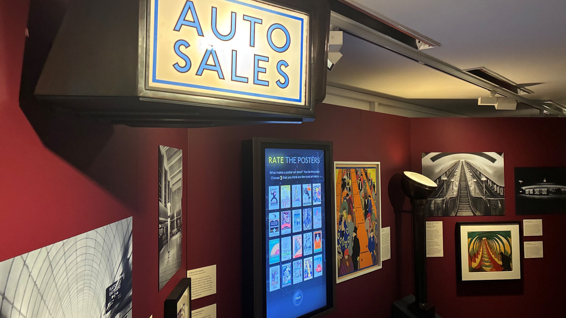
In the very early days of creating the exhibition, the most surprising thing was that the term “art deco” didn’t actually come about until the 1960s. It was only really when the style was re-evaluated, and people bunched together these similarly styled decorative arts. At the time, in the 1920s, it was just known as Style Moderne, or just Moderne, so it was really branched together as anything modern from the time.
This meant that art deco is difficult to define – and art deco for graphic design might be very different from art deco for ceramics or fine arts. So, it’s been interesting and quite challenging at times, as I’ve looked at a poster then thought “is that art deco?”. Doing research, some academics describe it as a grouping of styles rather than one singular style – I can see how that works, because it’s different to pin down and there are lots of different influences.
Although the defining moment was the 1925 Paris Exhibition, there are examples of art deco from the 1910s. In retrospect, we can now see it was earlier, but the Paris exhibition of 1925 was huge… 16 million people visited and that was where you could see a more unified style brought together across decorative arts and industrial design.
Are there many new posters or items on display as part of this exhibition that are not normally on show?
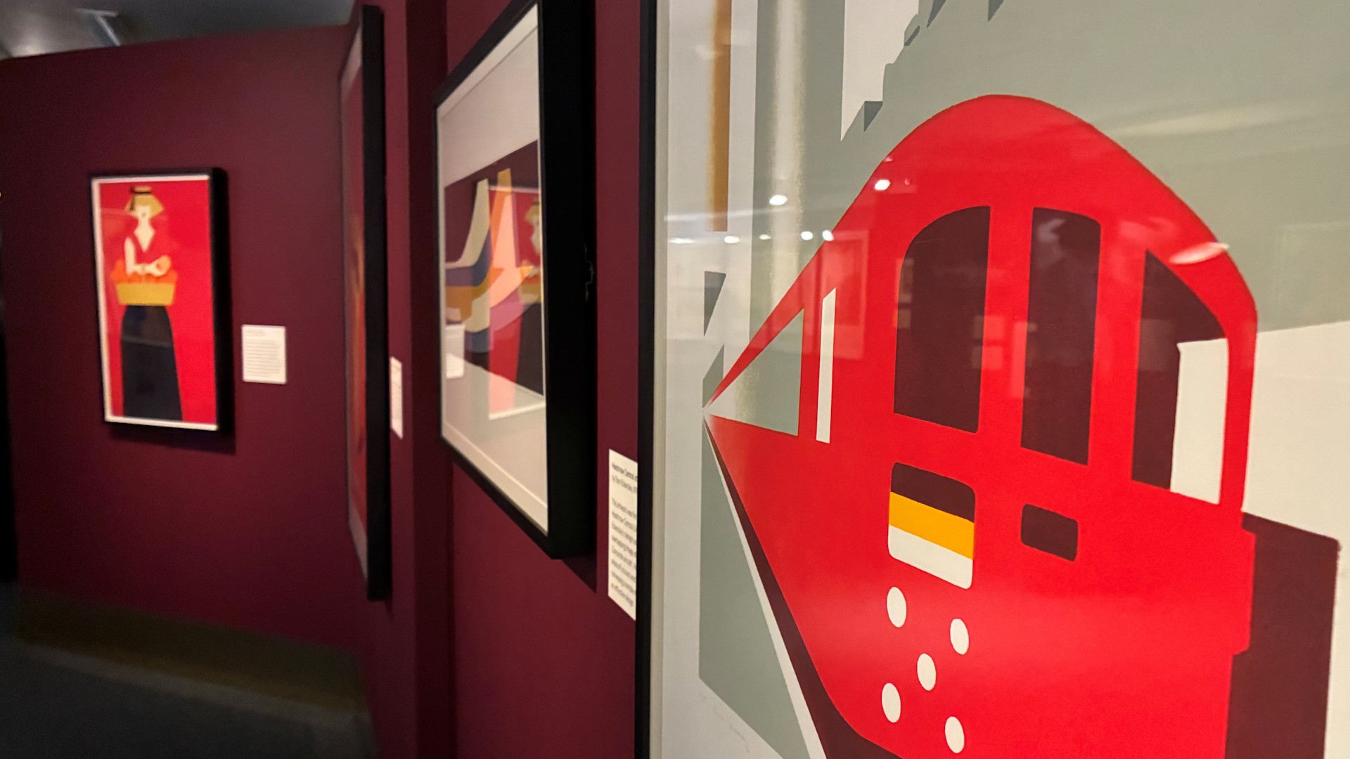
We have around 30,000 posters in our collection, but within this exhibition about a third of the posters on display have never been on show in the museum. It’s a great opportunity to have them on display… they are for the public and I really wanted to show off those that haven’t had their time.
We also have loans from nine different lenders, including The V&A. Most of the 3D objects are from lenders, such as the Fitzwilliam Museum, Northampton Museum, Shoemakers Museum and The National Motor Museum in Beaulieu.
Where are the best places to still see art deco design on the London transport network?
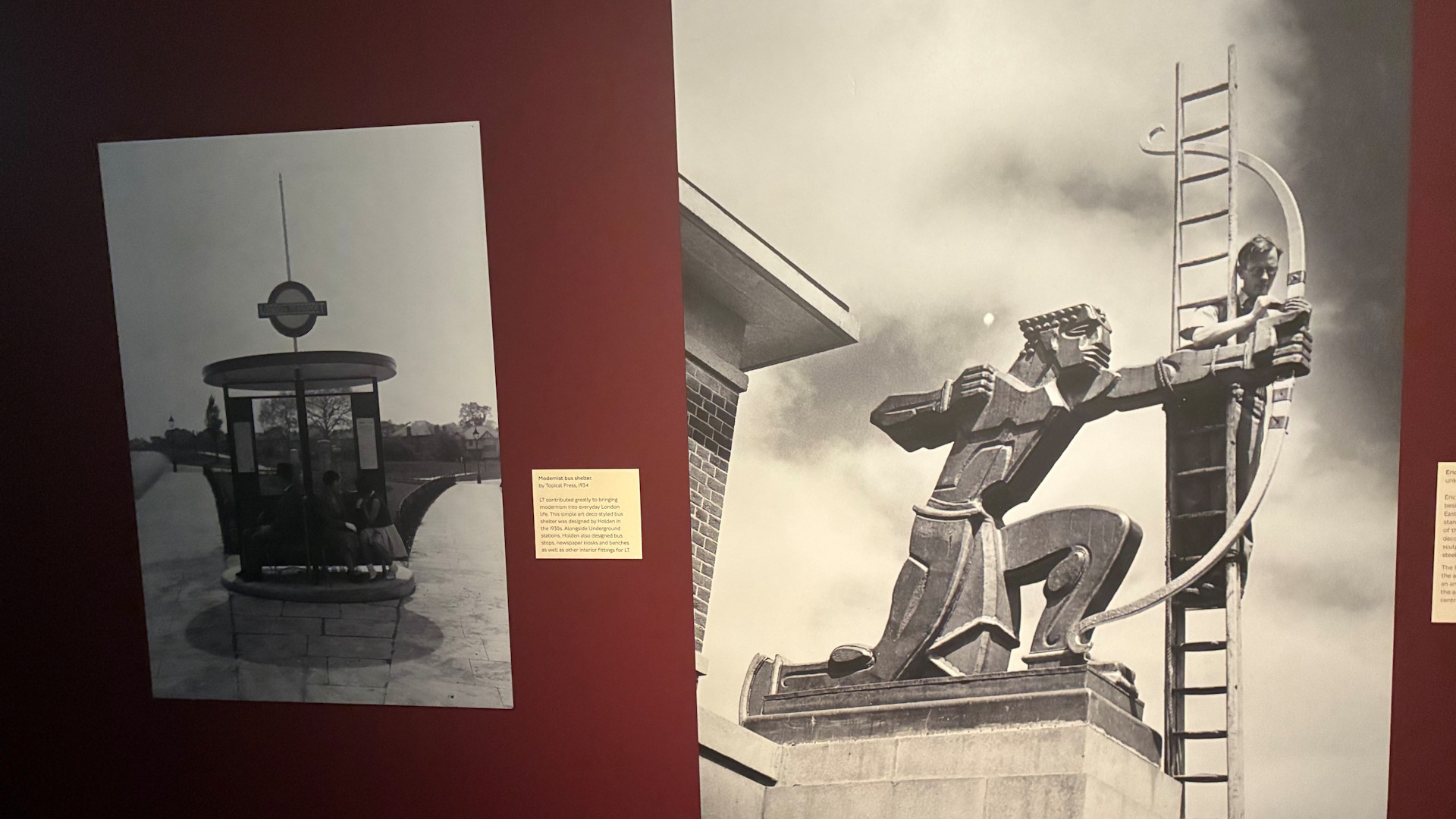
Mostly the Underground stations – particularly the Piccadilly line extension (both ways, north and west) and central stations such as Piccadilly Circus, with its beautiful booking hall which has art deco lights and marble, and Southgate, which has some art deco lights. At East Finchley, there’s a sculpture by Eric Aumonier outside called The Archer and a lot of its architecture is art deco, with curves, glass and steel.
It’s difficult, because a lot of the architecture by Charles Holden is actually described as modernist, but you can still see a lot of art deco influence in the fixtures and fittings.
What else is going on as part of the art deco season at the London Transport Museum?
We’ve got a talk on 6 December by Dr. Emma Bastin from Art Deco Society UK about art deco on the Underground. Next year, we’ve got a Friday Late on 20 March, so there’s a lot going on.